Dear user,
We are pleased to announce the official launch of new SafePal logo, a brand-new image for our users.
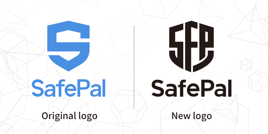
Over 5 rounds of internal discussion and iteration, our design team is honored to demonstrate the new SafePal logo with the following changes:
- The new SafePal logo has remained the shape of a shield, indicating our resolution to always put “Security” in the first place when serving user demands.
- The main color has been changed from blue to black, delivering a stronger feeling of security and advanced technology.
- The new logo has adopted SFP in its main body, which is the abbreviation for SafePal, further enhancing brand recognition on the consumers’ side.

Although our logo has changed, our commitment of delivering secure, easy, enjoyable crypto management solution always remains unchanged. The brand image upgrade will not impact any product using experience nor after-sales service moving forward. Welcome to join our community and share any valuable feedback and suggestions.
Hope you like our new image. May you enjoy the secure, easy, enjoyable crypto life empowered by SafePal.
Thank you.
Veronica Wong
CEO of SafePal


